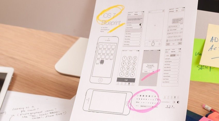
A website wireframe is a visual prototype of a web page that focuses on content, layout, and behavior. There is usually no styling, color or graphics involved.
It’s like a blueprint for a house that shows plumbing and electrical plans without the interior design.
A website wireframe is used to map out the main features and navigation of a new website design.
It gives an idea of site functionality before considering visual design elements such as materials and color schemes.
Why make wireframes?
It may be tempting to skip wireframing and instead provide clients with high-fidelity mockups. However, wireframing offers some major benefits:
- Wireframes are simple black and white layouts that outline the specific size and location of page elements, site features, conversion areas, and navigation for your website.
- They are devoid of colors, font choices, logos or any real design elements that take away from the focus on the structure of the site as a whole.
- We often say that they are like the blueprint of your home, where you can easily see the structural location of your plumbing, electrical and other structural elements without any interior design treatment.
- Translating a site’s information architecture into visual design paths by defining navigation elements such as headers, sidebars, footers, and buttons
- Spotting any potential problems and flaws before they become major hindrances
How to Create a website Wireframe
#1 Start with sitemap
You want to create a sitemap of an existing website or create a new information structure, discuss content strategy, and build individuals.
Your sitemap is a checklist; Layouts are an outline. They take into account page goals and information flow.
Wireframes allow web design teams to consider the purpose of a visitor – from UX to copywriting. The structure of the site – navigation, organization of primary pages and subpages, user flow through the conversion funnel – is all brought to the fore in a wireframe.
#2 Determine your website wireframe size.
Your wireframe will need to vary in size depending on the screen size you are building it for. Mobile devices, tablets, and desktops will vary in screen size—not to mention that windows can be scaled up or down on a desktop.
To get the most accurate measurement for your wireframe, use pixel measurements instead of inches or points. Here are the standard sizes for each screen type:
wireframe size for mobile screen
1080px wide x 1920px tall
wireframe size for tablet screen
8” tablet – 800px wide x 1280px tall
10” tablet – 1200px wide x 19200px tall
wireframe size for desktop screen
768px wide x 1366px tall
#3 Website wireframe design.
Now it’s time to visualize your user flow in wireframes. If you’re using physical pen and paper, we recommend using dotted paper or grid paper to keep things aligned.
This will help you convert a physical version of your wireframe to a digital copy more easily.
#4 Response to wireframe
Your website will go through several rounds of tests and modifications before it goes live, but it’s still a good idea to get feedback on your wireframes in the early stages.
Collaborate with your design and development teams as well as any internal staff and customers to get their opinion on flow. Getting input now prevents the essence of UX from getting lost once you’ve added buttons, screens, and page layouts to the mix.
Conclusion
If you want a functional website, you must first start by creating a proper plan for executing the design. With a wireframe, you can easily map the elements of each page and make changes as needed. As your project nears completion, the number of errors will be significantly reduced by the time it takes to create the wireframe.
Start with a low-fidelity wireframe and take your time adding the details. When shopping for an appliance, take the same precautions to find one that suits your specific design needs.

